

LEGEND - UX Design Case (EN)
This is a Legendary Product, where I understood the importance of a holistic view. It was a challenge to evangelize the UX process from an initial step to its final iteration, but here I present incredible details of the steps for creating a system for Interactive Touch Screen, which is used by real estate agents, as an assistive tool in the presentation and sale of developments to clients.
Context
At Skyline we develop solutions for the marketing and presentation of real estate developments, in additional tools for real estate brokers to present the best real estate products.
Business goal
Generate a digital transformation in the way the demonstration of a launch of a new building or development is carried out, bringing the Broker to the center of the presentation.
Solution
We use technology to create interfaces and interactions, bringing a friendly experience between the real and digital world in the way projects are presented by the broker to booth visitors.
My role
UX Designer and Project Coordinator. Responsible for UX Research, Workshops, Prioritization, Interface Design, Usability Testing and QA. Acting as a bridge between business and engineering.

Skyline - Inovações e Produções, is a Brazilian Startup Bootstrap, which I had the pleasure of being the first UX Designer, between Jan/2019 and Nov/2019, focused on Innovations and Smart Media Solutions for the Real Estate and Corporate Real Estate market.

LEGEND - Sunset Square is an example of conceptual and contemporary architecture in downtown Goiânia / GO (Brazil), where coexistence and modernity share the same space. Beyond imaginable, it goes further and integrates the proposal of the high standard and the luxury of living well.
The challenge
I was challenged to reimagine the presentation of an enterprise and create an innovative experience for THE LEGEND, a luxurious enterprise, full of concepts that should jump beyond paper leaflets and printed books, pulling everyone towards a digital immersion, where the smallest details were as clear as the sun, making them shine in everyone's eyes. Enchanting from the first blink of an eye, bringing feelings to each interaction and eliciting smiles at the end of the presentation.

My activities
I acted as Product Manager / Product Design - User Experience (UX) and User Interface (UI) - for the entire duration of this project/product. I also had the support of a team with 2 designers, to collaboratively have other perspectives about what could be worked and delivered, thus generating more value in deliverables, bringing empathy and diversity.
My tasks:
1. Ideas and interview with Stakeholders and Customers
2. Building a Vision on the Project.
3. Planning, Prioritization and Scope definition.
4. User Interface and User Experience.
5. Micro-Interactions and Metrics of Quality and Experience
Combination of Design Tools: Figma

As the main objective of the team for the project was to collaborate actively and fast deliveries with handoff without many complications, Figma was the appropriate tool for the project, gathering all the documentation, deliverables and evolutions.
Design process


Each designer had their own Design process, I believe that in this project I applied my best design process, centered on the user but balancing Business and Technology.
We started the design process understanding the business with a good depth, scripting and conducting interviews with Stakeholders and Users, doing our homework analyzing Competitors, looking for standard behaviors and habits.
I believe that these steps are important to put an end to guesswork and bring real data to the table, which really help to guide a work with valid ideas and less errors.
After the creation of the Personas or Proto-Personas, we move on to User Flows, which helps to have a good direction in the Wireframes stage, where we can make mistakes and change our ideas more quickly. With all the inputs, we started to conceptualize the solution in a freely, and we were able to see the proposed solutions taking shape, but when we started the high-fidelity interface it was possible to apply some design principles, such as Contrast, Information Architecture, Usability, Branding and Micro-User Interactions.With the interface ready, I could receive strategic and visual feedback from the team about the deliverable.
We need to invest resources on creation of the Component Library, because throughout the projects we will have good results, practicality in the reuse of components and styles of easy modification and real gain in scalability.
In the Validation Steps, despite being part of the common design process, this step is of great importance, as we validate the proposed solution with the user before investing resources in programming, thus delivering the best possible.
1 Level - User Experience
.png)


%20%20UX%20Personas.png)


2 Level - User Interface


I understand the business
Balance is a very important piece in the development of any product, project or service journey, but understanding the main business, in the design process, is the first step. With a series of interviews and conversations I could understand deeply about the needs of the company, business rules, and current processes already implemented.
In this case, I prepared an interview with the team, where each interview had a specific question script. We started with Skyline CEO, Andreyve, as he has a huge background of more than 6 years of knowledge in the this market. After that, we proceed to the interview with the Development team and understood better their vision of the product at the technology level.

Stakeholders Map
Stakeholders are people interested in the project/product who have a contribution to make with a big influence, helping us to guide strategic decisions. They are also important sources of feedback in stages prior to development, helping to validate the real value of each delivery.
In the image bellow we have an example of how to map and align it, helping us organize our approval process for deliverables, helping important decisions, and who to communicate updates to.

Research with Users

That is the soul of the UX process. I recruited 5 people from each group to interview, taking into account the recommendation of Donald Norman's article, “Why you only need to test with 5 users”, noting that it is possible to learn about 80% of the mistakes, problems and behavioral patterns of the 6 first users.
I prepared an interview script for each audience. For Realtors: In order to have the best understanding of how the developments and the process of selling real estate are presented.
For Customers / Buyers: Questioning the motivations of the purchase, and the steps to the final purchase decision.
It includes Leo, our CTO among 6 people interviewed, as he intends to make a purchase of new property, still in the plant.
The interviews took approximately 30 minutes, and included topics to capture the essence of what users are trying to do and what the problems are for each group, asking as open questions as possible.
Brokers Interview
1. What types of developments do you sell?
2. How do you present a property to the client today?
3. How do you demonstrate the differences of each AP?
4. Where do you get the content from?
5. What kind of incentive do you offer to get contacts?
Buyers Interview
1. How do you look for an apartment to buy?
2. What is the time between the research and the final purchase decision?
3. How do you get information about an apartment?
4. During the presentation of the broker, did you still have doubts?
5. What suggestion would you leave after visiting the sales stand?
Perceptions of the interviews
Analyzing the interviews and the large amount of data generated, I bring some information with a great level of influence on the solution, demonstrating the great importance of conducting interviews and obtaining validations. We had a high level of interest on the part of those contacted for the interviews, making the bonuses a secondary motivation.

What we see is that, although printed books are the most used options for presenting an enterprise, sometimes it has outdated or incorrect content, frustrating some visitors. For the brokers, with the need of a digital transformation, WhatsApp has become the most used channel for receiving and sending content to indicated clients or stand visitors. However, for always using cell phones with “small” screens during day-to-day presentations, some important details of our luxury development are lost on cell phones. The contents are hardly passed on efficiently to the brokers, and the project's website is not always updated with all the information and details. The main objetive of the website is capturing leads for marketing campaigns.
Desk research
We researched about how works the sale of other high-value goods and habits related to the buying process, focused on purchasing decisions. The goal was to understand how competitors behave in their presentation process and sales flow to potential interested parties, and I also found that the process of choosing to purchase a high-value development take more time, and it is less receptive to purchase by impulse. Summing up, we have a more rational purchase, where: location, blueprints, and technical details can be decisive factors.
We put it as the objective of Competitor Analysis, so we can have information to win any market competition, and not to copy them.
Competitor analysis
Direct competitors are companies that offer the same or very similar value proposition to our current or future customers. This means that Construction Company and Real Estate Developers are spending their time and money on marketing strategy, using a direct competitor's product, instead of our product, to solve their business presentation problems - whether they have the best interface or not!
Indirect competitors offer a similar value proposition to a different customer segment, but as they have a diverse target audience, can be included our exact customer base without offering exactly the same value proposition. For example, an indirect competitor's primary service may not be its value proposition, but the secondary service they offers is definitely a possible solution or our customer base is using a website design service to solve the problem that our amazing product will solve soon!

UX Personas
UX Personas helps to identify the real user of a product. With well-defined personas, we are able to develop solutions centered on the user and their needs. Personas are the average of several possible ideal users, with real aspirations, tastes, needs and problems.
We performed a persona creation dynamic based on the data from the previous interviews. It took some post-its to physically write the data and gather all the collected information, then we were grouping the post-its, and thus forming the characteristics of our UX Personas to be used at each future stage of the design process. With them well structured, we looked at the personas and question ourselves how and why that deliverable will make sense to the user.


User flow
The main point of the User Flow is a technique that allows you to quickly map the entire flow of screens on your system.
This technique works well to align the paths and actions that the user can take.
The home screen works as a screen saver, after a touch users are directed to the Menu, where they can choose what they would like to see, so they can go back and forth in the system. We work according to a presentation order, so that the presentation can follow one of this two paths: scripted or free. As long as you return to the menu and then choose another option.

Wireframe
In this step we work on the Wireframe in a collaborative way with the team, directly on paper to map fundamental elements in the interface, focused on the strategic part of the system and less visual, in order to tangibilize our ideas. Thus we could make an unification of the different views, aligning architecture of the information, interaction stages, and the possibility of quick tangibilization of ideas. Later, we made a version in low digital fidelity.

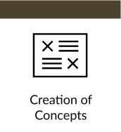
Concept Design
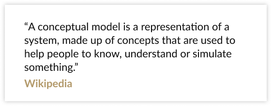
Conceptual models are made to be very abstract, creative concepts are nothing more than metaphors that designers use to help people understand how a system should work visually.
The idea at this stage is to be free of some things that “block” the process. Let's forget about rules at this point, bringing more memorable interface experiences, and show a design that reminds you of a system reference in the real world.

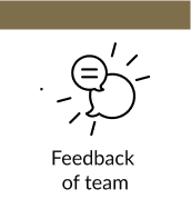
As we developed the concepts in Figma, get team feedback on each concept screen is something fluid and fast. We obtained numerous strategic feedbacks focused on Usability, Contrast to Accessibility, Cognitive Load of the elements and possible scalability as the project progresses.
Summing up: the team left comments on numerous parts of the concepts and we collaboratively responded to solutions, so that we always have a record of the decisions to be made.
Colors
The brand's guidelines led us to choose a serious tone but with luxury refinement, and we choose dark gray tones to contrast the white and make the luxury remarkable at first glance.
The Gold tone gives the interface a more luxurious look, with a high contrast in black and white.
For the texts, we alternate between white and black to ensure reading and contrast, reaching adequate levels of accessibility.

Typography
As 50% of users said they spend a period reading details and other information, we understand that a display and readable font needed to be applied, but without losing the concept of contemporary luxury. Therefore, we use the combination of the typography of the BW Modelica Family for the Titles and Buttons, combining with the Font Family Aleo, mainly applying the Light version with greater spacing for texts throughout the interface.
BW Modelica
A Geometric, Minimal, Robust, Reliable Sans, its clean shapes make it a true Display font. It is perfect for Body text. Available in up to 64 styles, including oblique italics.

Aleo
With a serif contemporary design, semi-rounded details and an elegant structure, this font brings a strong personality, maintaining high legibility.

Photos
To better illustrate the whole concept of the enterprise, we decided to humanize the interface. We chose images that demonstrate a sense of seriousness and refinement. 2 main photos were chosen for the home screen, which present the parallax effect, generating the sensation of constant movement of the models. The photo of the main menu in black and white increases the contrast level with the buttons, but delivers all the refinement of the branding,

Component Library
The Component Library is part of the idea of investing time in the beginning, generating benefits in the medium and long term. Organizing and classifying requires an investment of time, but in the medium term, any unforeseen and necessary change is only made to the main component and it is automatically applied to the derived components throughout the system, saving hours of adjustment work.
Here we follow Atomic Design organization concept in our components, working as a language shared between design and programming, which only has benefits, reducing development time and how the code components are reused by the programmer during development process. We have an efficiency gain, reducing the changes in a few lines of code, which reflect throughout the system, without having to code each object from scratch.

Prioritization
It’s not every time that we can deliver everything quickly, so we use the prioritization process, balancing: Business, Users and Technology. We used the knowledge from the previous processes to make a list of functions that would be delivered in the initial MVP. Based on our interviews conducted at the beginning of the project, we prioritized what will add more value for our end user and also included the look of the development team, because each functionality has a different level of techincal difficulty. Thus playing towards to the bottom of the priority list tasks with a high level of complexity for the developers and less value for the users.

Roadmap
The roadmap organizes the goals and stages of delivery of the system, it can also be found the start dates of development of new features, improvements and upcoming versions, and it also works as a launch record.
The LEGEND system should not become just a one-time delivery. It should be developed continuously considering: usability tests, A/B tests and continuous research with users to improve the initial MVP version.

Validation
This stage is where we present our design solutions in a functional way to the user. We create a roadmap of activities that the user must perform, describing or not, each action. During the accomplishment of this task, we follow attentively, listening and writing all the feedbacks received, so that after this process we can adjust improvements and send to the development team to implement a validated solution that will work in the real world.
But remember: the launch of this system is only the first step towards the success of the product. Analyzing metrics such as time on each screen, frequency of interactions, total clicks, the path the user took, collecting feedbacks after the launch, would be important to understand the success and elaborate the product evolution roadmap.

Usability Tests
When carrying out an internal Quality Test, we fixed bugs, started the Test with real users of the product, asked the users to perform specific tasks: Show the location of the enterprise, Explain the plans and Send the content by Email and request to narrate their experience during use .
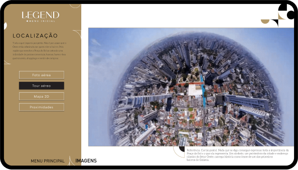
During the tests, everyone was surprised by the 360º Airline Tour, where people can move around in 360º and see the important points in the vicinity of the project, but this feature is only available when connected to the internet, but in most of the sales stands , the internet is not available in the first weeks of the
During a conversation with the CTO / Programmer, we made an improvement, when we access the Location sector, the system checks the internet connection, if the connection is not active or at low speed, the 360º Airline Tour with its content and replaced by a Tour video rotating 180º, lasting 1 minute.

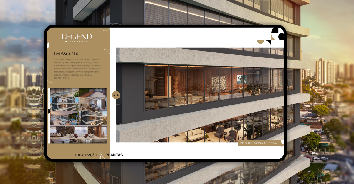
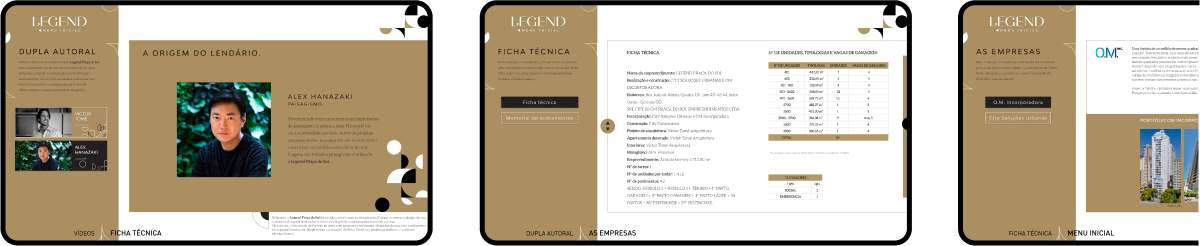
User Interface
After all the stages of the process, this was the interface delivered and implemented. As we can see, all the details stand out and transmit their goal, which is to show in detail how the LEGEND is a luxury development.


Functional prototype
The functional prototype is used for usability tests, presenting a preview of how the system or product would be after being developed. Even using Figma, we still have some limitations, such as Field Filling, 3D and external functions with APIs. However, other parts shine through the eyes during navigation, such as animations, transitions, microinteractions, and the possibility of reproducing .gif during the presentation.
* Works on PC only!
Activation - First contact
As during all our design process was focused on the user and how easy it should be from the first to the last interaction with the system, that onboarding was something natural and instinctive, without the need for a step-by-step tutorial. We use as many affordances as possible during creation in order to reduce the cognitive load in use.
We usually have a small meeting with some brokers and give some instructions on how to navigate the system, but the process only takes 5 minutes. The rest is intuitive, placing the broker as an essential part of the scripted presentation, the system being just a tool that helps your work.


Usage Metrics
We implement anonymous tracking on users' actions, following the LGPD regulation, which does not allow reversing the user's anonymity. With all the time usage metrics in hand, we analyzed and noticed that a significant amount of presentations were initiated and followed the entire proposed presentation script. The demonstration of the enterprise during the sale became more dynamic, maintaining the average time of presentation of the brokers, but increasing the happiness of the visitors. An important point that made the product a success.
Below we can see some examples of usage metrics, such as the fastest presentation duration, the average presentation time and the maximum time that a presentation was completed. We decided not to include in this average paused presentations that were inactive for more than 5 minutes, but at the end we can see the percentage of presentations that were not completed.
Success and its Results
To better evaluate the results of the product, we conducted a survey with 43 people of the real estate market, including Marketing Directors, Brokers, and Users served at the stands, with the objective of obtaining quantitative information about the LEGEND system. We had very rewarding results, along with a lot of praise for the team. Below it's possible to see the simplified search results.


Thanks to the team
A big thanks to the people who participated in the design team, we are all part of the Skyline family.
Special thanks to Andreyve (Partner-Commercial Director), Bruno (me), Luisa (Editor), Debora (Designer and Architect), Micaellen (Branding / UI Designer), Leo Andrade (Engineer and Programmer), Gabriel (Partner-Direto) de Video) and Nathalia (Art Director).
That is all.

